Girl, Interrupted: The Behavior of Type
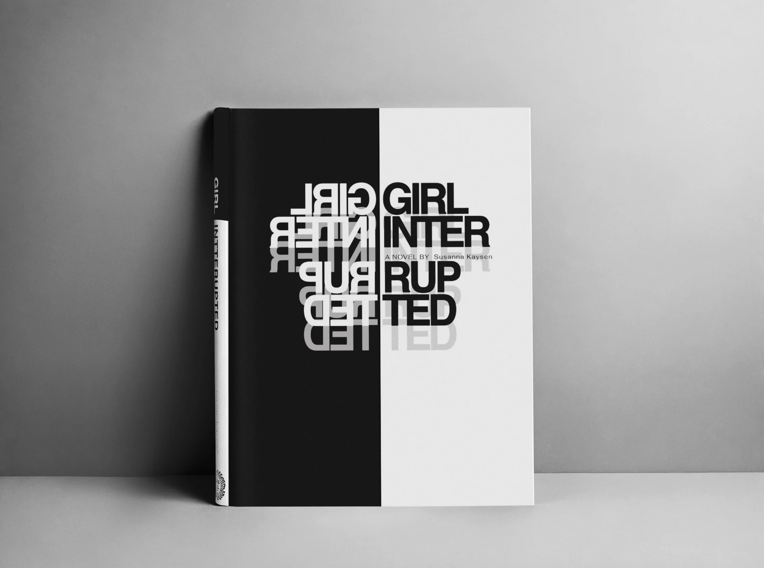
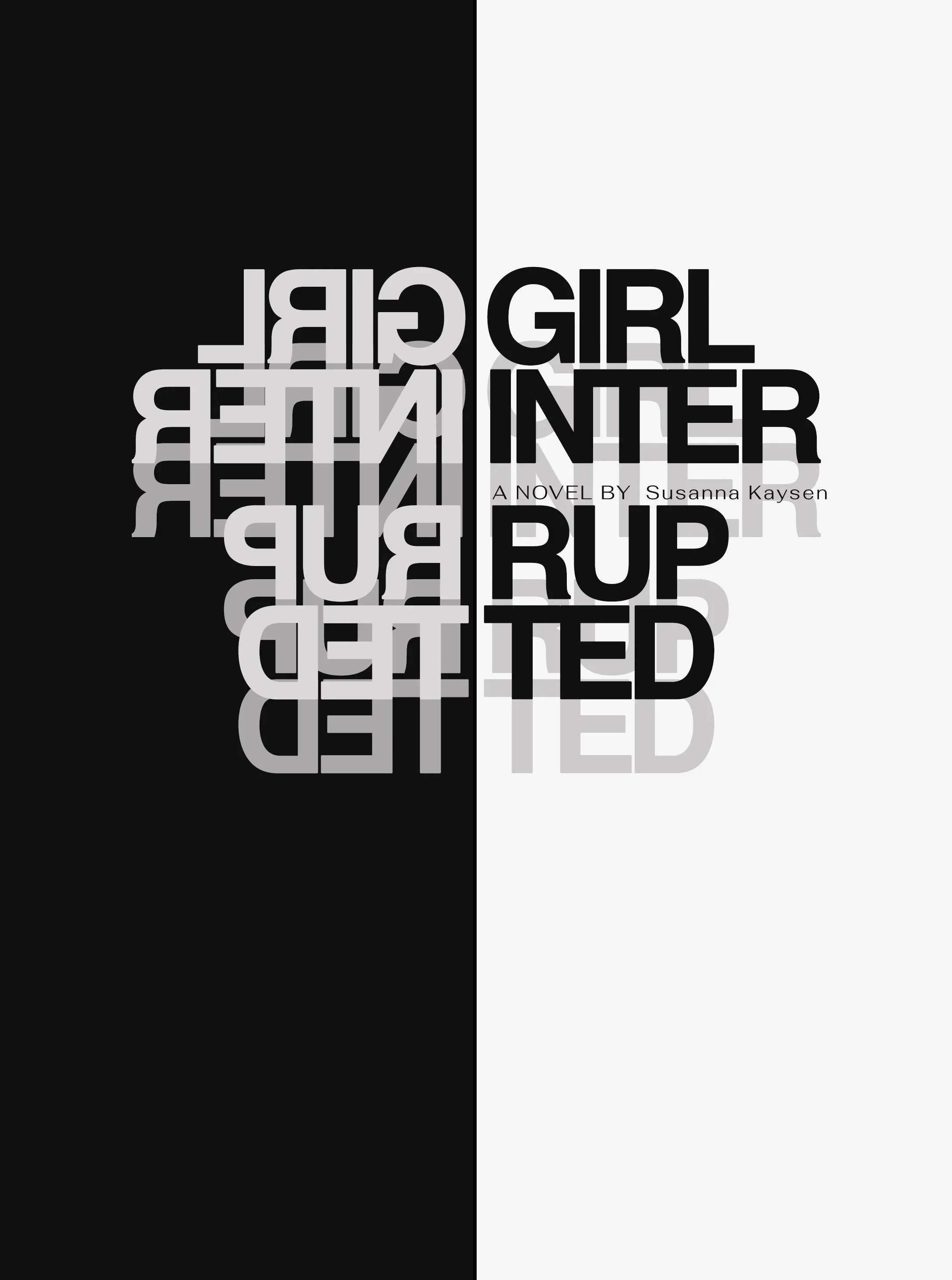
The typography does more than name the book. It behaves like the book feels. Girl, Interrupted follows Susanna Kaysen’s account of her time in a psychiatric hospital in the late 1960s, moving between personal memory, institutional records, and the question of how a person comes to understand herself. In this redesign, type becomes the central image, shifting between clarity and distortion to reflect the instability of internal experience and the way identity can be interpreted from the outside.
Finding the Interruption
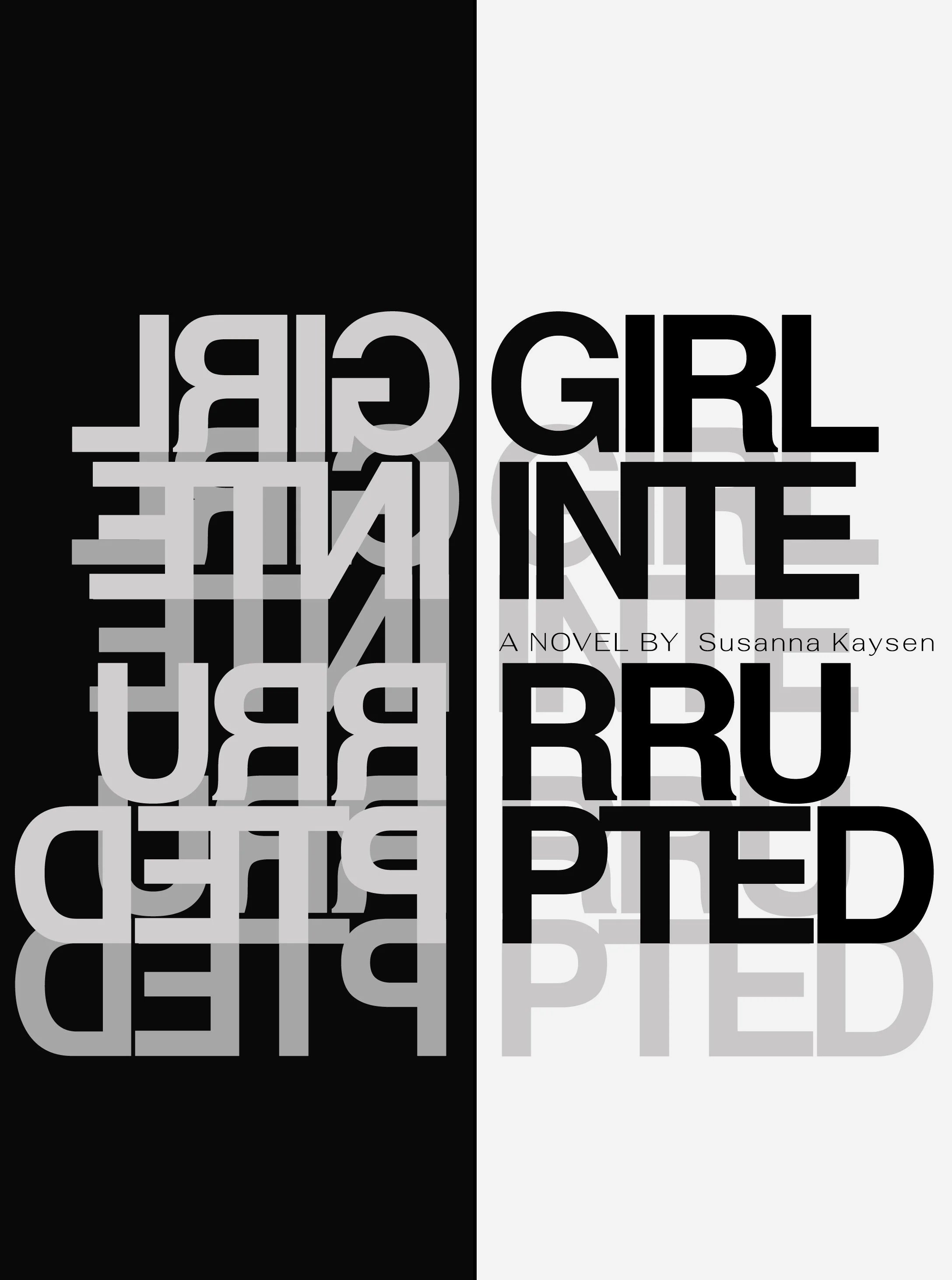
The process began with a simple break in the title, then moved toward a more psychologically charged typographic treatment. Mirroring, splitting, and the black-and-white palette tied the cover to psychological behaviors, while the layered type suggested the chaotic thoughts and emotions happening beneath the surface. The readable title still carries the basic information, but the overlapping forms reveal that there is more happening internally than the surface can communicate.
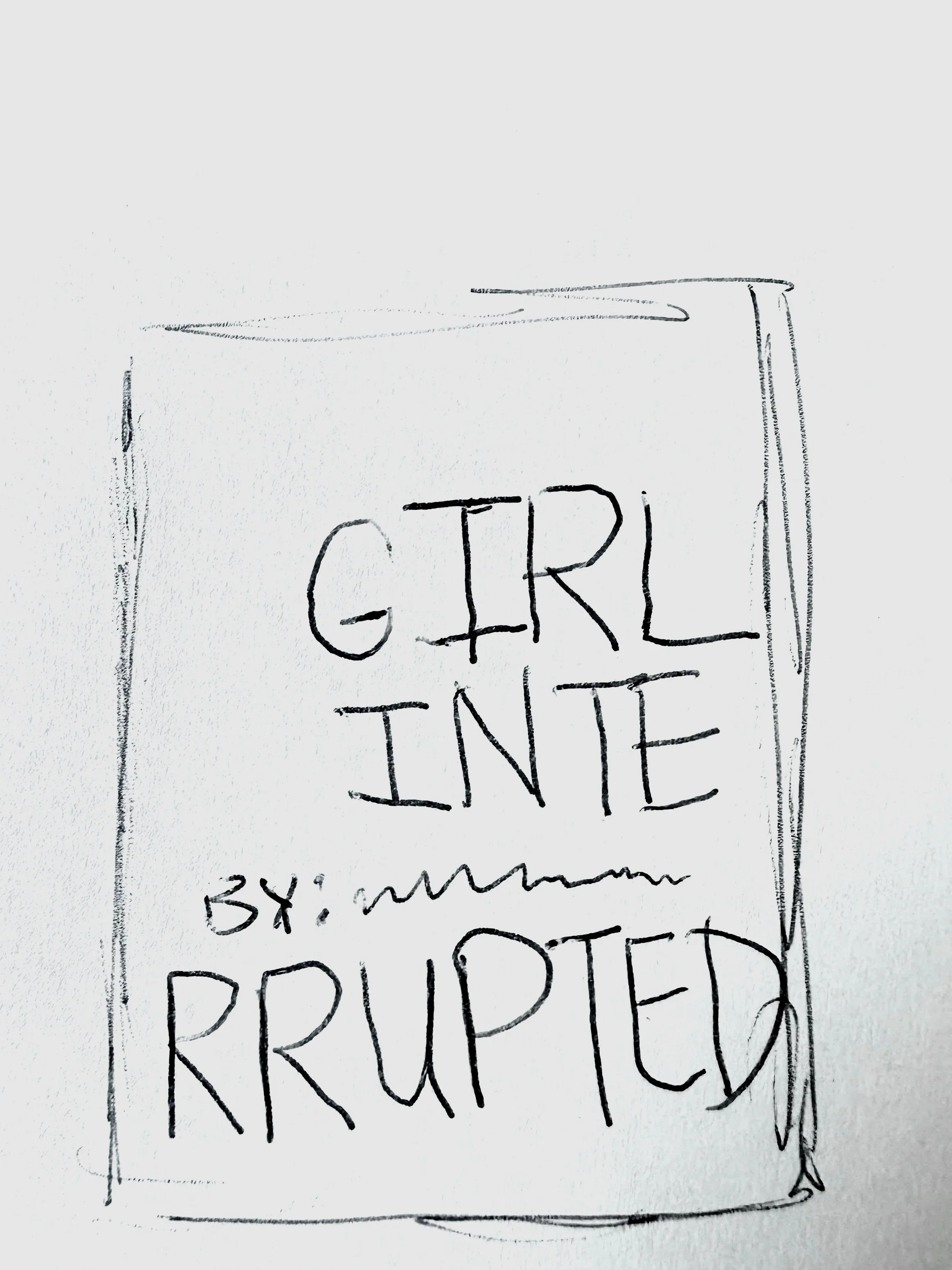
In early versions, the words were split in unnatural places, creating the awkward interruption the concept called for but making the cover harder to read. The final direction shifted the breaks closer to natural syllables and reduced the scale of the type, keeping the emotional tension while giving the design more balance and function as a book cover.
What’s on the Surface
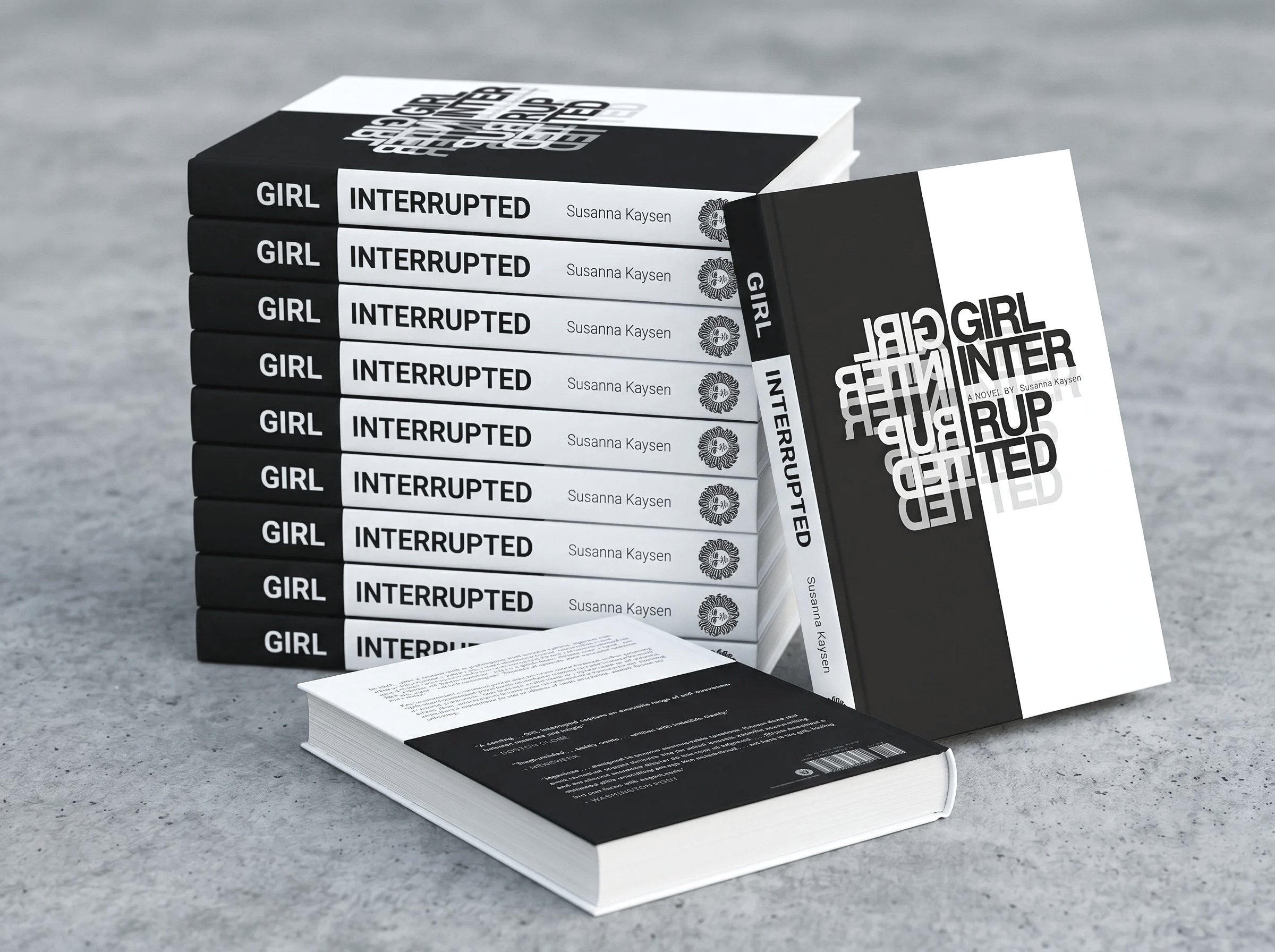
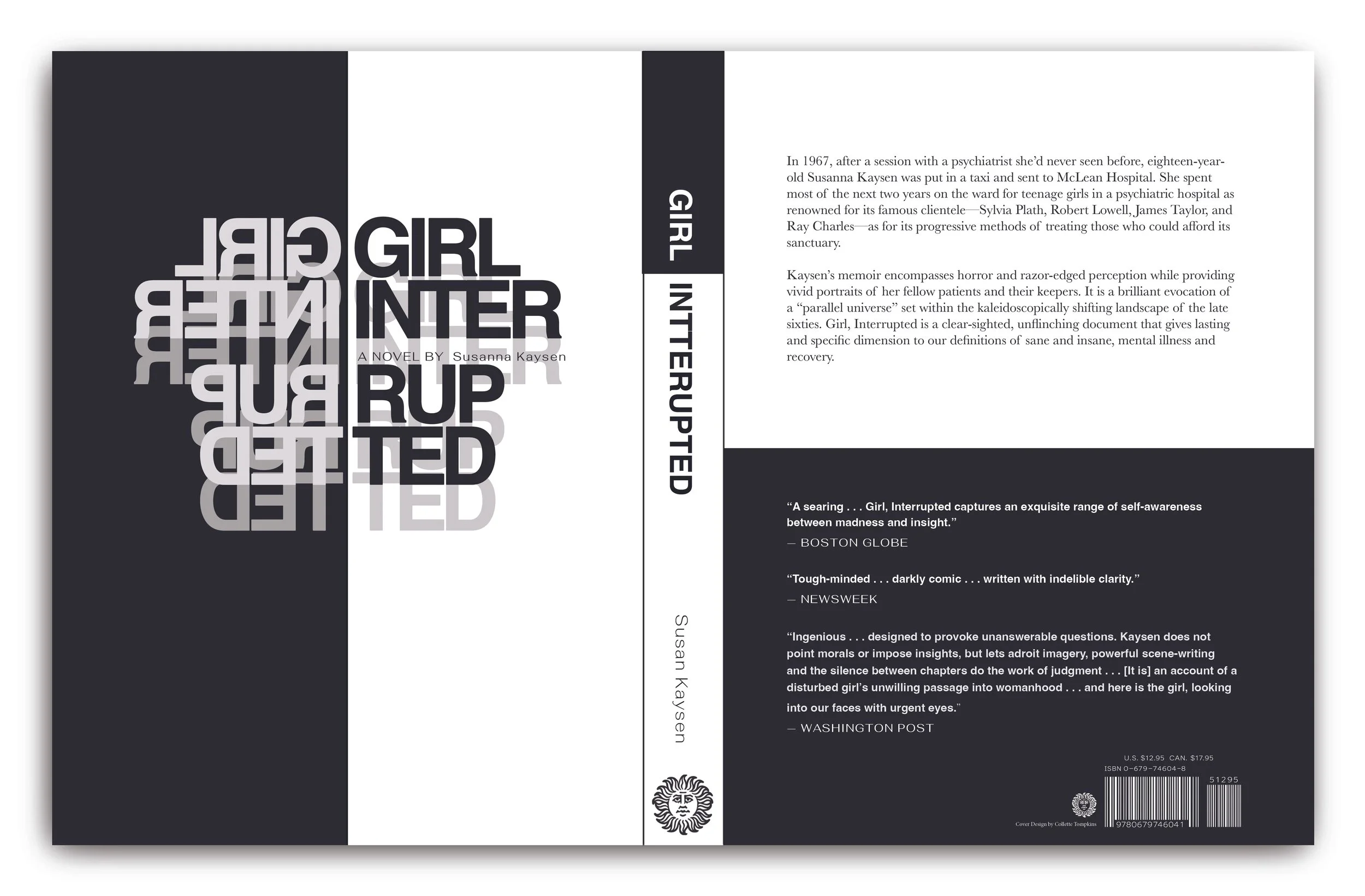
The full jacket turns the black-and-white concept into a working cover structure. The front cover carries the strongest visual tension, with the layered title treatment acting as the main image. As the jacket wraps around the book, the design becomes more functional. The spine keeps the title recognizable on a shelf, and the back cover uses the split to separate the synopsis from the reviews. The same visual language carries the emotional tone of the book while keeping it clear, readable, and functional.
Opening Up
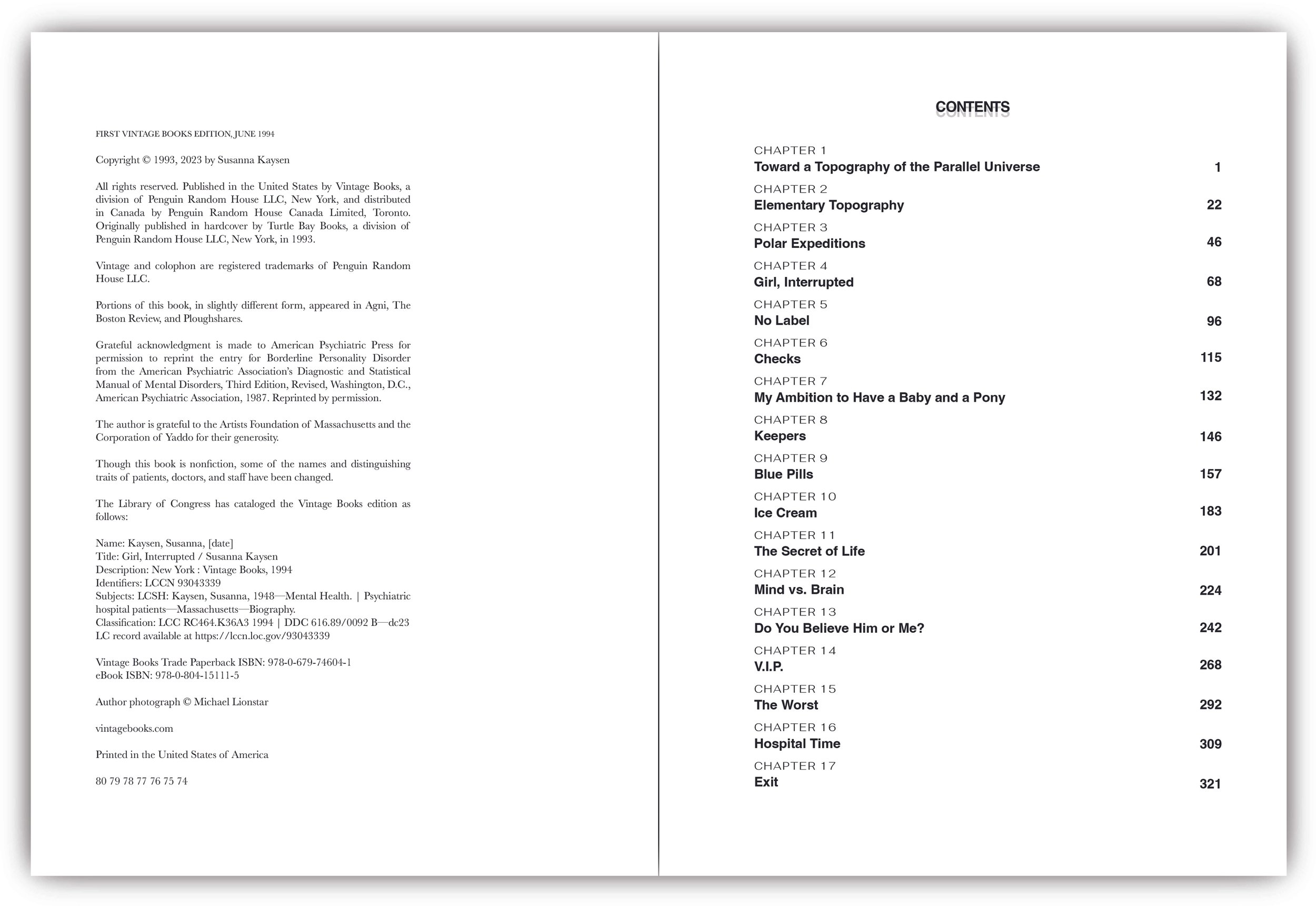
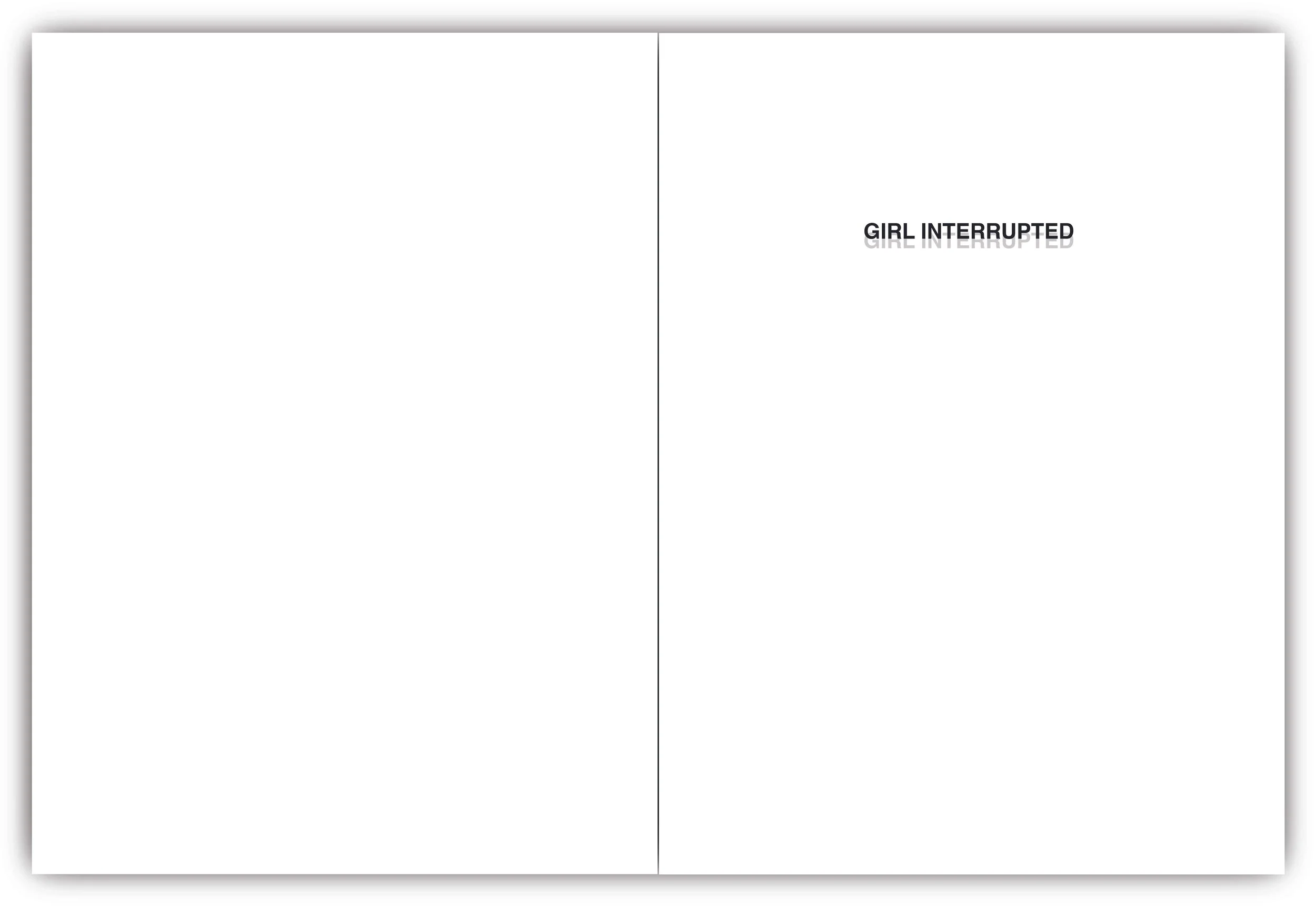
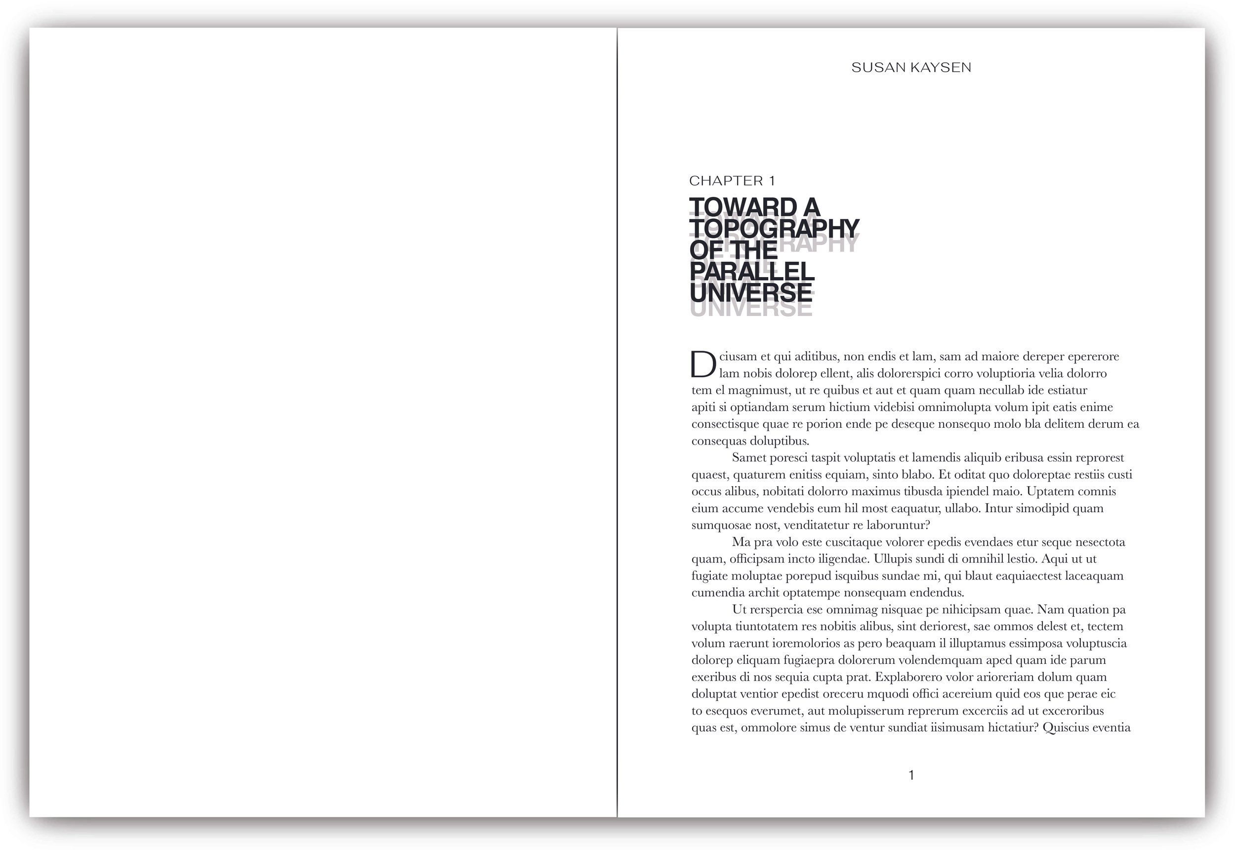
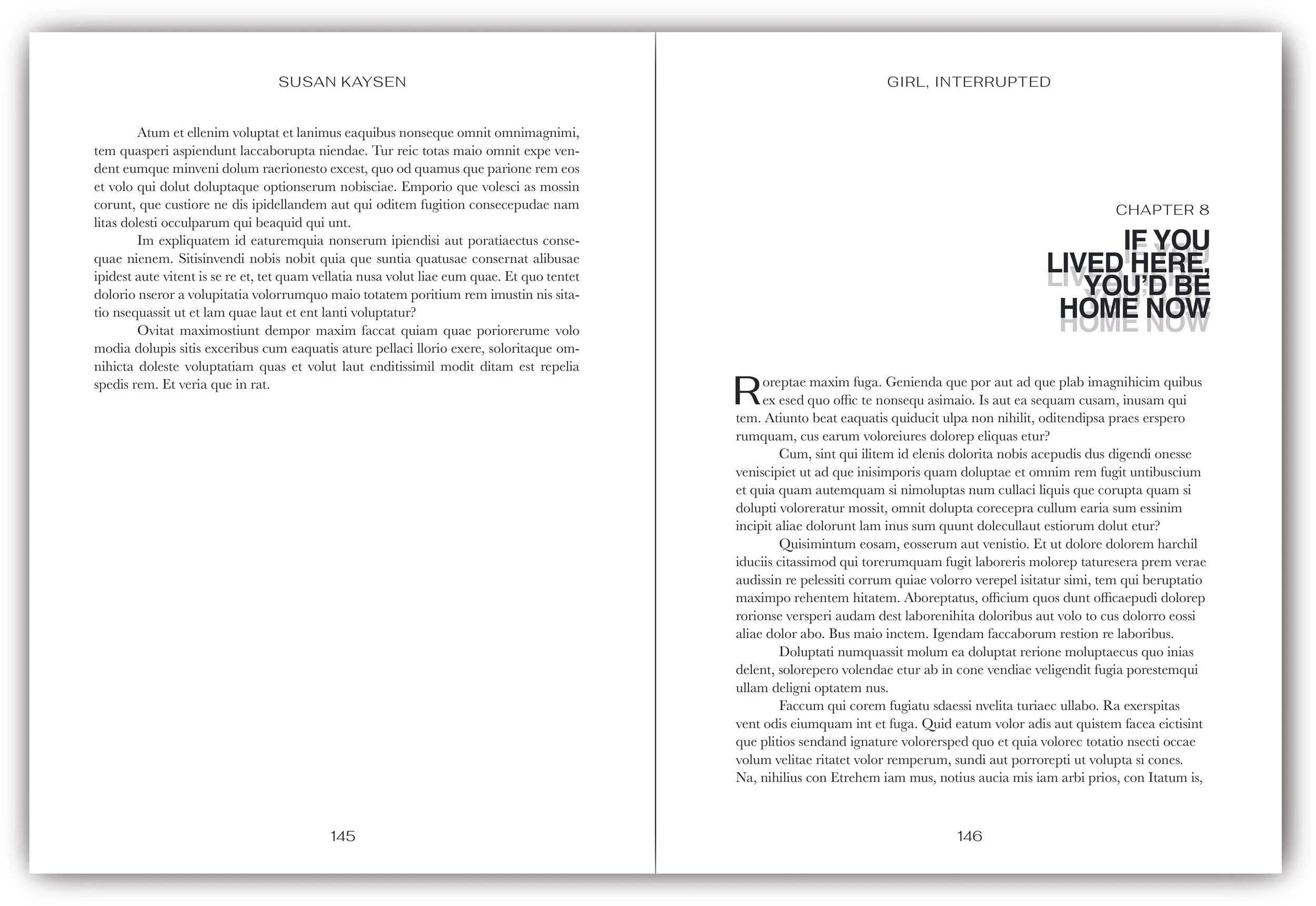
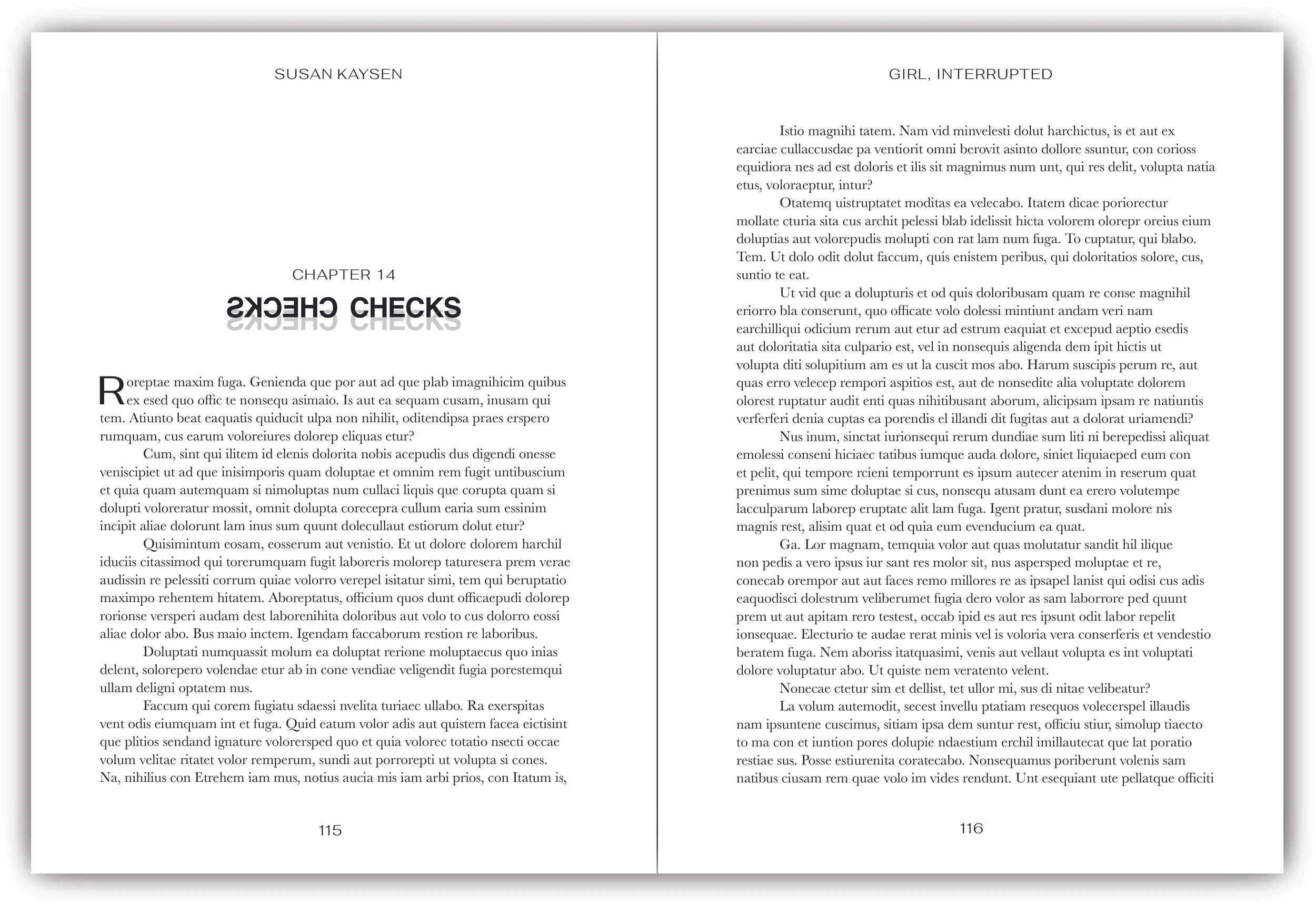
Once the cover opens, the design shifts into a more functional rhythm. The interior pages stay clear and restrained, using small typographic echoes to connect back to the jacket without repeating its intensity. The result makes the project feel less like a cover concept and more like a complete literary object.
Starting a New Chapter
The chapter openers bring the cover’s typographic behavior into the reading experience. Each title becomes a small moment of interruption before the body text begins, echoing the instability of the cover while still allowing the page to function clearly. The design gives each chapter an expressive entry point without letting the typography overwhelm the act of reading.

Becoming Whole
The final book shows how the typographic system supports the identity of Girl, Interrupted beyond the cover. The layered title treatment gives the memoir an immediate sense of tension, while the black-and-white structure creates a framework that can carry through the jacket and interior pages. It becomes more restrained where readability becomes important as the system moves through the book. It allows the design to stay emotionally connected to the memoir without overwhelming the reading experience. The result is a complete memoir that feels expressive, functional, and true to the book’s tone.